Jun
27
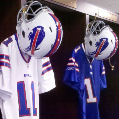
The Buffalo Bills have done away with the ugliest set of NFL uniforms. The monstrosities they had been wearing since 2002 looked like 3 different uniforms pieced together; all bad. They couldn't decide if they were navy blue, royal blue, or both, and they had more helmet stripes than the rest of the NFL teams combined.
Thankfully, the redesign has brought the opposite: simplicity. They're not e...
Read More
Jun
14
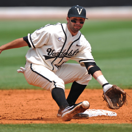
The College World Series is about the only time most of us pay any attention to college baseball (if we even do then). From a design standpoint, it's fun for me to look at because college baseball isn't on TV very often, so I haven't seen many of the uniforms before. It's interesting to see how schools adapt their identity to baseball uniforms. Many ditch their primary logo used for most other spo...
Read More
Jun
7
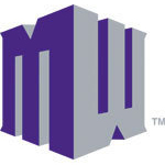
The Mountain West Conference unveiled a new logo today. I've seen it compared to Nintendo 64, White Castle, and the BBC show Dr. Who. No mentions of anything sports or conference-related, though, and for good reason. It doesn't look like a sports conference logo. Not that that's necessarily the worst ...
Read More
Jun
3

After a few posts about team colors, I wanted to look at the evolution of team logos, much like I did with team colors. First up is the NFL.
Using the great sportslogos.net, I compiled the chart below. Stick around below the chart and read my team-b...
Read More