
Jun
14
Ranking the College World Series Teams’ Jerseys
The College World Series is about the only time most of us pay any attention to college baseball (if we even do then). From a design standpoint, it’s fun for me to look at because college baseball isn’t on TV very often, so I haven’t seen many of the uniforms before. It’s interesting to see how schools adapt their identity to baseball uniforms. Many ditch their primary logo used for most other sports in favor of a more traditional lettermark.
Since the 8 teams that will make up this year’s College World Series have been determined, I thought it would be fun to look at the eight teams’ jerseys. Below I’ve ranked them how I think they stack up, starting with the worst. Let me know in the comments below what you think.
8. North Carolina

North Carolina has the most unique color in college sports, and they fail to use it well in baseball. Really, they may only use it well in basketball. The 2nd jersey above is the always-ugly solid powder blue look. The Kansas City Royals have tried it, the Philadelphia Phillies have tried it, the Toronto Blue Jays have tried it…and they all looked like they were wearing scrubs. Really, the only combination I like is the 4th one, but I would like to see it with a Carolina blue hat. For some reason, UNC feels all their hats need to be two-tone. I would like the 5th one if it weren’t for the ugly light blue side panels.
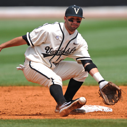
7. Vanderbilt

When Vanderbilt and North Carolina play in the opening round Saturday, it will be the ugliest game (aesthetically) of the tournament…unless Vandy wears the last uniform in the graphic above, which is my favorite of all 8 teams (see it here). I think it’s beautiful. The other 5, however, keep Vanderbilt at spot #7 on my list. The thick stripes at the ends of the sleeves make the jerseys all look like they’re from the 80s, and the pants stripes are also thick and bland.
6. California

Cal’s jerseys suffer mostly from bright yellow being the predominant color, but also lack anything at all exciting. The type on the jerseys and the hat is bland, and they just kind of look like they picked some generics from Nike’s team catalog.
5. Texas A&M

Texas A&M has a few combinations that look nice. Really, if they’d ditch the two-tone hat in the 3rd picture and the maroon side panel in the 5th picture, they’d be pretty solid overall. Only having one bold team color helps, and they’re able to use the same mark as their other sports well. I like the state of Texas on the sleeve as well.
4. Florida

Florida’s bright blue and orange almost knock them down a notch, but their simplicity keeps them in the top half. In baseball, it’s usually a good bet to resist any sort of extra elements on jerseys (even more so than in other sports). No matter which combination Florida puts together each day, you pretty much know what you’re going to get, and none of them are too bad.
3. South Carolina

This is where they start to get good. South Carolina’s last three jerseys above are great. The one in the middle is probably my second favorite to Vandy’s. It (and the 2nd one) lose some points for not including South Carolina’s primary color at all. The only other thing keeping the Gamecocks out of my #2 spot is that stupid stripe on the side of the pants in the first picture. Other than that and the lack of garnet on two of them, South Carolina’s uniforms are great. Much better than their football jerseys…
2. Texas

Texas has great uniforms in most sports due to simplicity and their unique color. Baseball is no exception. I’d like to see the Longhorn logo on the hats, but they have their own unique type on the jerseys and they’re not cluttered up with anything ugly. I like South Carolina’s last 3 above a little better, but as a whole set, I’d give a slight nod to Texas.
1. Virginia

Virginia, like Texas, just has a classy set of uniforms all the way around, with the exception of the White Sox-style throwbacks. But knowing they’re throwbacks, I love UVA for pulling those off. The first and last picture above are great uniforms. The orange is a little bright, but being as tight as the top 3 were in my mind, the awesome throwbacks and classy home and away sets give Virginia a slight edge in my book.
What do you think? Check out my college team colors map here.