
Mar
30
An Open Letter to the Georgia Tech Athletic Department
I know I’ve posted two Georgia Tech concepts on this blog (football, basketball), but just let me add this and I’m done; just gotta get it out of my system.
Dear Georgia Tech Athletic Department,
Thank you for providing me with some of my favorite moments of my adult life — somehow ending up down one row from where I started at the Alamodome celebrating Will Bynum’s layup that sent Georgia Tech to the National Championship game, completely ignoring the massive headache I incurred while taking an elbow to the head in the process, screaming at the TV as Roddy Jones ran down the sideline in Athens to add to a lead against the preseason #1 rival Georgia Bulldogs, and taking a trip to Tampa to watch the Jackets win an ACC Championship, no matter what the NCAA says.
I love Georgia Tech sports. And that’s why it’s difficult for me to see them have such inconsistency in another thing I love — graphic design in sports. Within the Georgia Tech community, we’ve given ourselves a reputation recently of “caring too much about uniforms,” partly due to football coach Paul Johnson saying he’s never had so many questions about uniforms. I don’t think we care about them any more than any other fan base; I just think we’re unhappy with the current state. In the Chan Gailey days, I didn’t hear any Georgia Tech fans talking about uniforms. We were talking about Chan Gailey. Sports fans complain about the things they’re unhappy with. If Paul Johnson doesn’t want to hear about uniforms, he should have a couple 7-5 seasons.
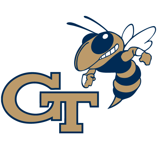
For me, it’s not just about uniforms, though. Being a graphic designer, it pains me to walk into the Georgia Tech bookstore and see 3 different shades of gold apparel. It annoys me when I see black and yellow Georgia Tech bumper stickers. Every time I see a Georgia Tech state-issued license plate, I wonder where the skinny version of the GT logo came from. These are the things that make it more than just a personal distaste for our football uniforms. Georgia Tech has a brand consistency issue.
Coca-Cola wouldn’t allow multiple shades of red to be sold in the World of Coke gift shop. Nike wouldn’t allow thinner and thicker versions of their swoosh to be printed on merchandise. So why should Georgia Tech as a brand allow these things to happen?
But this letter isn’t just a complaint. I love Georgia Tech, and I work in this industry, so I’m offering a solution. The beginnings of one at least.
One Gold
First, establish one gold. I understand why there are two golds now — the Buzz gold and the Ramblin’ Wreck gold — but it’s confusing. Pantone 124 is used on Buzz and football field graphics, 874 is used on the Ramblin’ Wreck, sports uniforms, and the basketball court, both are used for logos and merchandising, and both golds are paired with both navy blue and black.

The current set of official Georgia Tech colors
My recommendation would be to ditch Pantone 124 and black altogether. The school’s colors are “old gold” and white, and navy blue is the tertiary color, so they should be used for everything. They’re already used on all the sports uniforms, so why can’t everything else get it right?
The biggest change would be Buzz. He would now be gold and navy, not yellow and black. I understand real yellow jackets are yellow and black, but there are many schools whose mascot is the school’s true colors instead of its real-life colors. Even if this was a non-negotiable and Buzz had to stay yellow-gold and black, stop there and don’t use them anywhere else. Then, for all merchandising, uniforms, and logos, it’s Pantone 874, white, and Pantone 539 (navy blue).

Update the Brand
 Once the colors are established, there are a few things that need to be updated. First, the typeface with the thick block shadow used for the “Georgia Tech” wordmark is very dated and needs to be replaced. I would recommend a slab serif typeface that matches the interlocking “GT” logo, something like the custom type I’ve done below.
The simple, serif type would set Georgia Tech apart from all the cookie-cutter college sports identities as a more prestigious academic institution in addition to being a major college sports program.
Standing Buzz is ok for promotional use since it is an illustration of the physical mascot, but the standard buzz above should be the only one used as an official logo. The flying Buzz with a trail of black behind him should go into retirement with the block shadow type.
So to recap, here are the old and new brands for comparison’s sake:
Click to see full size
Application
Once you have a consistent brand, you’ve got to implement it in all areas so it’s just that — consistent. I’ve gone ahead and applied it to a few things.
One problem with the uniforms in all sports has been the shade of gold. It’s been closer to Pantone 874 than 124, but it hasn’t been either. It’s been more of a light, yellowish “Vegas gold.” With this new, consistent brand, it will be important to match the proper gold as closely as possible. I’ve done that with the football uniforms below, and as I explained in greater detail in this post, using this darker gold will set Georgia Tech apart from other gold teams with lighter shades, like Vanderbilt, Purdue, and Colorado. I’ve also simplified the jersey style, using elements of Georgia Tech’s past uniforms, which is also described in detail in the football uniforms post.
Click to see full size
I applied this new style to the basketball uniforms as well. The only thing I didn’t carry over was the new wordmark since the text on the jerseys is based on past Georgia Tech basketball uniforms and I thought it worked well. The football and basketball jerseys share stinger-inspired pants stripes. You can read more about the basketball uniforms here.
Click to see full size
The football field currently uses yellow-gold field paint despite the team jerseys and the Ramblin’ Wreck being metallic gold. Here’s a field design using the proper gold and new wordmark. It also has yard marker numbers in the typeface the wordmark is based on.

Here is the basketball court with the new colors and wordmark. With gold being the predominant school color, it’s a perfect opportunity to take advantage of the stained wood basketball floor trend.

Like I said, I love Georgia Tech. And I love seeing good, consistent branding in athletics. I think it’s time to make a clean break from all yellow and black and any outdated typefaces and logos and move forward with a consistent, unique brand that’s unmistakable for Georgia Tech. The interlocking GT logo and Buzz are both iconic, and gold, white, and navy blue should be as well.
Plus, what better way to open a brand new basketball arena than with a beautiful new court that fits in with a new identity system?
Click to see full size
Sincerely,
Steven Little
Georgia Tech, Class of 2006