Sep
16
Uniform Concept – Georgia Tech football
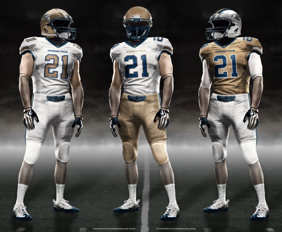
As you’ve probably figured out by now, I’m a huge Georgia Tech fan. And as I stated in my 2011 college football uniform updates post, I am not a huge fan of Georgia Tech’s football uniforms. I’ve always seen uniform concepts presented online in that Nike Pro Combat style using these great uniform templates (thanks to the super-talented Fraser Davidson for creating them), but I’ve never opened one up and played around with it, mostly due to lack of free time. I’m a graphic designer by profession, so I thought I’d finally sit down and give it a shot.
First, a little Georgia Tech uniform history, because all good design is informed by what came before it. If you just want to see my design, jump to the bottom.
For years, Georgia Tech had very traditional uniforms. They’ve worn white, gold, and navy blue tops (and even black for a little bit) and always had gold helmets with the exception of a few years in the late 60s/early 70s when they wore white.
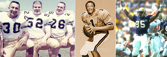
Once the arm stripes you see in the pictures below were established, they stuck around for a while. One thing you’ll notice below is the thing Georgia Tech (and their fans) can’t seem to get straight – the shade of gold.

Russell is Georgia Tech’s uniform supplier, and GT is the only BCS conference school that uses Russell. I believe the founder of the company is a Georgia Tech grad or something… Once Paul Johnson was hired for the 2008 season, Russell ditched the traditional uniforms, and this is where things went bad.
That first year, they tried to go back to Tech’s official “old gold,” but I’m not sure which shade they were going for… it looks like a blend of the school’s official “gold” and its official “metalic gold.” And they did so in a matte finish, which doesn’t tend to work so well for gold, so it came out looking like mustard.

The next year, they went back to the lighter “Vegas gold” the team had used in the Chan Gailey years. It’s not Tech’s official color, but it looked much nicer. Then in 2010 the uniforms changed, and I actually really liked those ones. This year, they’ve gone back to the previous design with all Vegas gold, including the numbers. There were actually so many complaints about seeing the gold numbers from far away that they’re getting a new set tomorrow for the rest of the home games.
One thing Tech did bring back when Paul Johnson came aboard that I do like is wearing white at home. Getting gold jerseys to match gold helmets is tough, and Tech’s white jerseys generally look better.
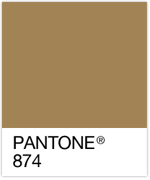 So when I sat down to design what I wish Georgia Tech actually wore every week, the first problem I had to solve was the shade of gold. I used the most logical approach I could come up with, and that was to use the school’s official Pantone color – Pantone 874. The Vegas gold can look nice, especially when it’s more metallic like in the Chan Gailey years, but it’s not the school’s official color. Using this darker gold would set Tech apart from other, lighter gold teams like Vanderbilt, Purdue, and Colorado. And Georgia Tech wouldn’t look like mustard bottles or, as Paul Johnson said when he got to Tech, “french fries.”
As far as design, I wanted to come up with a modern update to what Tech had worn for years before Russell abandoned it all. I always thought the sleeve stripes on the old jerseys were a little boring, and the two stripes were too far apart. But Tech had used them for years, so I didn’t want to abandon them – just refresh them.
I wanted to make sure to keep the main school colors, old gold and white, prominent while using the third, navy blue, as an accent. I came up with three sets: 1) an all-white away jersey, 2) a white home jersey, and 3) a gold alternate. Click the image below to see the full size.
With the away jersey being all white, using navy blue numbers made gold very tertiary, so I used gold numbers. Even though that’s creating problems now, they worked in the 90s when the gold was darker, and this gold’s even darker than that. And I gave them a thicker stroke than the other jerseys’ numbers. With gold being plenty prominent in the home version, I used navy blue numbers, but made “Georgia Tech” gold to keep more gold on the jersey.
One thing I knew I had to do was something like the throwbacks Tech wore a few years ago that pretty much every fan loved, myself included. The one thing I didn’t love was the mustardy gold. Keeping the same gold here makes them Tech’s third uniform in a matching set. And it becomes necessary about once a year when a visiting team chooses to decline Tech’s request to have them bring their dark jerseys.
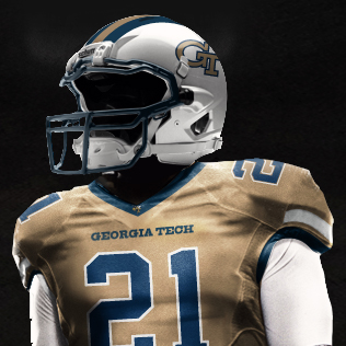
I believe simpler is better in most design, so I simplified a lot of little things. The collar on Tech’s old jerseys was a little too busy – there were 5 colored lines on them. I made it a simple navy collar and added the mascot, Buzz, who hasn’t been present on the uniforms previously.
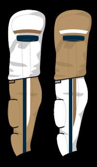
The arm stripes I mentioned were way too far apart, so I brought them closer together and cut the top stripe off on the outside of the shoulder pad since jerseys rarely have much sleeve to them nowadays anyway. And I think that gives it a more modern look than simple lines all the way around the sleeve.
Another thing I simplified was the pants stripes. Again, the old version had 5 stripes. I brought it down to 2 (3 if you count the thin, pants-colored line between them) and gave them a little updated feel, kind of merging the old pants stripes with the current, stinger-like ones.
I also changed “Yellow Jackets” to “Georgia Tech” across the chest on all uniforms simply because I like that better. And I used a bolder font than what is used now, which is also more similar to the lettering of the GT logo.
So there you have it. I wrote a lot more than I anticipated, but it’s because this was a lot of fun. Whenever I have the time, I’ll try some other schools, and I’ll do the same for basketball come hoops season.
What do you think? Do you work for Russell? Can I send you these files? Please?


