
Sep
1
2011 College Football Uniform Changes
It’s been a while, and I apologize. I knew when I started this blog that it would be tough to post regularly, but I didn’t see the onslaught of freelance work that would take all of my free time as of late. If you’re interested in writing a guest post, let me know.
I HAD to write something now because it’s the best time of the year — the start of college football season. With the season starting today, I thought I’d take a look at all the teams introducing new uniforms this season. I’m just looking at FBS teams, and I’ll look at special, one-game uniforms, like Pro Combat and the Michigan/Notre Dame game unis in another post.
I like to keep this blog away from all uniform-ranking posts, so I’ll go in alphabetical order, but I will try to provide some commentary. Full redesigns are up first. Minor tweaks are at the bottom.
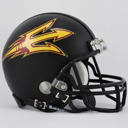
Arizona State

Starting off with a good one. Arizona State had one of my favorite redesigns this offseason. I love the new pitchfork logo, and it provides a more creative use of the helmet than slapping a logo centered on the side. It’s adapted well on the custom shoulder stripe that they won’t have to share with any other school as well. And I love the new trend of matte (non-shiny) black helmets. I don’t love the all-black uni combination, but like we’re seeing at a lot of schools, they’re providing lots of jersey, pants, and helmet options, creating a ton of possibilities week-to-week.
Arkansas State

Arkansas State will be switching to these. That’s all I know for now.
Baylor

Yikes. Not that Baylor’s had a long history of good uniforms (or football), but those pants… I generally love white helmets, but in the combos above, the white-helmet versions lack any gold in the uniform. Baylor should stick with this look.
Boston College

Boston College updated their uniforms, with the number font, loss of shoulder eagle, and new helmet being the biggest differences. While I didn’t really care for BC’s old number font, it was clearly BC’s at a glance. I like the conceptual nature of the new helmet stripe (inspired by stained glass), but it doesn’t quite come through on a football helmet… Similar to Kentucky’s checkers and Maryland’s turtle shells (see both below), a decent idea wasn’t very well executed.
Bowling Green

Bowling Green got a much-needed update. Their previous uniforms were pretty awful. It’s tough to make orange and brown look good, but these, while a little generic, aren’t bad. I like the falcon logo on the chest, and the number font makes them a little less generic. The pants stripe is a little thick, but overall much better than what they had before.
Buffalo
 Buffalo has gone from looking like Kentucky to looking like the Detroit Lions (and that’s a good thing). They’re not all that similar to the Lions, but the new blue reminds me of it and the number font is similar. It’s a nice, clean look, and I love the new, more unique blue. Unfortunately, the Kentucky-style helmet will stay the same. I hope they at least update the color to match the new blue…
Colorado
 Colorado’s new uniforms are basically old uniforms. They’re throwbacks they wore last year to honor the 1990 “National Championship” team (that split the title with Georgia Tech after getting this 5th down). They’ve been slightly modified and use a much better gold color for the helmet than the yellow-gold they’ve used for years.
Florida International
 FIU got a good update from last year as well. The pants are the same color as the jerseys, but it actually works well with the darker blue helmet. Monochrome’s not as bad when the helmet doesn’t try to match it as well, because usually it fails (like theirs did last year).
Fresno State

Fresno State got one of the worst redesigns of the offseason (don’t worry – my least favorite’s still to come). Sure, Fresno was stuck in the 90s the past few years, but they should probably try to get back to the 90s this season if it’s not too late. I’m not sure where to begin… the giant stripe under the arms is ugly. The pixelating fade-away stripes on the shoulders and pants aren’t great, and they seem totally out of place with the rest of the uniform. And the helmet… I guess they had to keep some of the 90s in their uniforms with that stripe (that also doesn’t fit in with the rest of this uniform design at all). Fresno’s trademark neon green V looks even worse on this helmet. And there’s no way that red helmet will mach that red uniform. It’s like Nike took a helmet, jersey, and pants from 3 different templates (with the pants being the only decent piece) and put them together for Fresno State…ok, I’m done.
Georgia Tech
 I love Georgia Tech (hence the color scheme of this blog). I do not love these uniforms. I did not love them when Russell introduced them in 2008 in mustard yellow. I grew to like, but did not love them when they became a better gold in 2009. And now that they’re all gold, including the numbers, I again do not like them. I may be alone, but I actually loved last year’s Georgia Tech uniforms. I also really liked the 2010 Orange Bowl uniforms. Why Russell keeps changing things up, and why they keep coming back to this design, I’ll never know…
This year’s numbers will presumably be tough to read from a distance and on TV, but I guess UCF pulls it off. Apparently Tech will wear a version with navy numbers, similar to 2009′s, on the road since Tech chooses to wear white at home. Sorry for all the Tech talk… onto someone else.
Hawaii

At first, I was all like, “Ooh, I like these new Hawaii uniforms.” And then they turned around, and I was all like, “Who are these weird lizard people with thin, green legs?” Take away those weird things on the back of the pants and these are solid uniforms. With them…
Indiana
 Indiana stripped the bad parts of last year’s uniforms away and left the good. Last year, they fell victim to Fresno State syndrome (see above) and had helmets, jerseys, and pants that looked like they were from different jersey templates. There’s nothing exciting about Indiana’s uniforms, but they’re classic and they look nice. It’s better to be boring than ugly. The Hoosiers have come a long way from the Antwan Randle El days. (Also, the helmet and pants will match; there just aren’t pictures of the real things floating around.)
Kentucky

Kentucky tried something, a la Boston College, and it more noticeably doesn’t work. The state of Kentucky loves horse racing, but I’m not sure what place it has in football uniforms. And jockey’s uniforms are ugly anyway. If they were much smaller checkers that were more subtle, it might be cool, but it’s on an ugly side-of-shoulder patch, and it just looks bad. I’ve never liked Kentucky’s super-shiny blue helmet, either. The white one is an improvement, but something makes me still not like it. I think it’s the lack of any sort of third color.
Louisiana-Lafayette

The Ragin’ Cajuns needed an update, but this still isn’t great… the pants don’t seem to match the style of the jerseys, and their helmets still suck (as do all text-based helmets). Their number font is unique to them, and like Kentucky, I like the idea to include some local flair, but gradients have no place in sports uniforms.
Louisville
 Louisville has had ugly uniforms for a while, and this is definitely an improvement. The numbers are still a little dated with the big shadows, and I don’t know why, but I always wish their helmet had fewer strips. But this is the best they’ve looked as far as I can remember. And they finally shrunk their wordmark a little bit.
Maryland

 Here we have it. Not just my least favorite redesign of the year, but maybe my least favorite football uniform ever. It’s like they’ll be wearing the worst of the Pro Combat uniforms every week. Next year’s SAT may have an analogy question that looks like this:
OREGON : NIKE ::
(A) Maryland : Under Armour
I love that they tried something unique with the helmet because it’s great when teams have something clever other than their logo slapped on the side, but they should have realized it wasn’t working and either fixed it or ditched it. Effects like the turtle shell here are cool when done subtly, and even though it’s gray, it’s very in-your-face. And the helmet stripe is a cool idea, but maybe a little less of it? It looks like a crash test dummy.
Then there’s the numbers, reminiscent of my former least-favorite-uniform-ever. Gradient plus more of the texture? Stop adding so much into these. And the yellow has just got to go. The only way I won’t gag when Maryland plays Georgia Tech this year is if they wear the red top, white pants combo (the most like last year’s uniforms, which were actually ok!).
Nevada
 Nevada swapped the ugly, old Miami template for the West Virginia template. Not great, but an improvement for sure.
North Texas
 North Texas is going all green. Yuck. And they still have an all-text helmet. Double yuck.
Oklahoma State

Oklahoma State is following all the trends – lots of helmets, lots of options, and a black matte helmet. And I really like it. These are nice and clean with some cool features like the arm and pants stripes design and matte black and gray helmets.
Purdue

I’ve seen a lot of hate for the new Purdue uniforms, and I don’t really get it. They’re plain, but I think they did simple really well. There’s nothing bad other than the chest stitching on the black jerseys, but they’re clean and modern, and I like them. The new helmet will just have one stripe.
South Carolina

I really like South Carolina’s new uniforms, and I’ve disliked theirs for years. The garnet jersey and white pants combo looks really good. Now if they would just stop using their ugly C + bird logo on their helmets and use the one they use for baseball…
South Florida

USF’s uniforms aren’t all that different from last year’s. I still like their white helmet, green jersey, white pants combo the best.
TCU
 TCU is adding new uniforms, but will continue to wear last year’s, too… The new ones have the colored side of shoulder like Kentucky and Louisiana-Lafayette, and somebody at TCU knows how to subtly add meaningful texture to design. Take notes, BC, Kentucky, and Maryland. The jerseys are ok, but I like the new helmet.
Texas Tech

Texas Tech improved over last year’s uniforms, but they need to just wear the white pants all the time. The all red is horrible. The white jerseys are much better than the red or black ones, too, since they have two colored stripes. Why no white stripe on the other two? The colored jerseys would look a little better with white numbers, too.
Utah

Utah’s uniforms changed and improved slightly. Another well-done, subtle, meaningful texture is the Utah topography on the pants. It doesn’t however, translate well to the black jersey. It could have, though, with dark gray topography. Oh, well. Also, white pants would make these much better since they have a red helmet.
UTEP
 Boy, did UTEP need new uniforms… They chose the generic 90s template, but anything’s better than what they had last year. I sound like a broken record, but try some white pants with those blue tops…
Western Kentucky

Last year, Western Kentucky made the Georgia Tech Orange Bowl template I like look bad with their giant name and shadow numbers. Now Russell gave them something simple, but nice-looking. I wish they’d do the same for GT. The Hilltoppers also have a new helmet that’s white with red stripes.
Washington State

I kind of like Washington State’s new look, although last year’s wasn’t bad at all. It’s a kind of matte helmet that isn’t black, and it still works. The gray uniforms are kind of cool, if nothing else for being unique.
So to recap, the biggest winners in my book were Arizona State, Buffalo, Oklahoma State and South Carolina. The biggest losers were Baylor, Fresno State, the backs of Hawaii’s legs, Kentucky, Louisiana-Lafayette, Maryland, and North Texas.
Here are some more minor tweaks that happened this offseason:
- AUBURN‘s pants stripes cut off diagonally at the bottom instead of going all the way down like they have in the past. This doesn’t change their status as one of my favorite home uniforms in college football.
- CINCINNATI has a new helmet that, if used, would be awesome.
- FLORIDA STATE added an FSU logo to their chest. They still continue to have one of the best college football uniforms.
- KANSAS‘ wordmark got bigger, and their numbers got thinner. I really like that they’ve kept their serif font from basketball and are applying it across sports.
- MARSHALL is trying out new wordmarks on the front of their jerseys. I like using a more custom logo on the front, but it’s just kind of an ugly wordmark.
- NORTH CAROLINA STATE switched their logo for “STATE” on the front of their jerseys. Plain, but nice.
- PENN STATE is making a uniform change! And it’s losing the neck trim on the jerseys (which I actually liked). Now their uniforms are somehow even plainer.
- RUTGERS adds to the list of black matte helmets, and as with most, I like it.
- SOUTHERN MISS has a black matte helmet, too, but the sides are different (and both ugly).
- TEMPLE is going back to the “T” helmet. Good. Why would they have left for a text helmet? Text helmets suck.
- TROY has a new wordmark on their jerseys. Seems a little big.
- TULSA has a new helmet with more stripes. They still have ugly colors and uniforms.
- VIRGINIA TECH added orange pants. They’re alright. Their throwback-style uniforms are great, though.
- WESTERN MICHIGAN has a new helmet. I liked it better without the “W.”
- WYOMING added more options. Unfortunately, they’re all still brown and yellow.
Anything I missed? What new uniforms do you guys love and hate?