
Sep
29
Guest Post – City Colors
I mentioned before that if anyone was interested in writing a guest post for periods when I’m too busy to regularly post to send me an email. This is one of those times, so here’s The Sports Design Blog’s first guest post, written by reader Alex Kerr.
If you’re interested in writing a guest post about whatever sports design topic is on your mind, send me an email at steven@thesportsdesignblog.com.
City Colors
by Alex Kerr
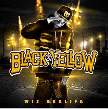
 Rapper Wiz Khalifa wrote last year’s #1 hit “Black and Yellow” about, most people believe, Pittsburgh sports teams. This is a fair assumption given that the official colors of all Pittsburgh’s major pro teams – the Pirates, Penguins and Steelers – are black and yellow. But if you bothered to listen to the lyrics, which I think only Wiz and I have ever done, you’d notice that he never actually mentions an athlete or a team by name. The song isn’t about the players. It’s about, as he puts it, “Reppin my town.” The colors of Pittsburgh’s sports logos have become synonymous with the people of Pittsburgh itself. If you’re not from Pittsburgh, I can’t blame you for thinking this has nothing to do with you. But it does.
 Until 2009, Pittsburgh was the only US city whose major pro teams all had a mutual palette, so you couldn’t really call the phenomenon a “trend”. Then, once the Sonics and Storm left, and the Sounders went pro, Seattle became the official city of blue and green. (The other two blue/green teams are the Seahawks and Mariners). While the concept of American cities developing unique color-identities is great for design nerds like me, the real benefactors are the most disregarded group in professional sports: the fans.
If LeBron James’s spectacular breakup with Cleveland taught me anything, it’s that sports fans can only depend upon each other. Athletes will leave you for titles, money or jail, and owners will take the whole damn team from you. I can relate.
As a lifetime 49ers fan, I wear my jerseys with pride. Yet every time the team owners threaten to leave their thousands of decades-loyal fans for not having the tax-dollars to cough up a new stadium, I am reminded that the iconic SF oval is really just their corporate identity. It doesn’t belong to the fans at all, even if we tattoo it on ourselves or paint it onto the hood of our cars. If/when the Niners move away, the whole concept of “red and gold” will be taken from San Francisco. But Pittsburgh and Seattle don’t have that problem. Their colors are more significant than any one team. If the Pirates moved out, for some reason, it’s the Pirates that would have to find a new color scheme, not Pittsburgh. To wear blue and green in Seattle or black and yellow in Pittsburgh is not to support one team or another, it is to support the city itself. Really, it is to support the fans.
City-wide color identities are the one thing fans like us can really claim as our own in the world of professional sports. With this in mind, I hope more cities encourage their teams to adopt uniform color identities. But which cities should go next? I’m glad you asked.
 First, I should note that this idea can’t be applied just anywhere. Most major cities have a team or two with a logo too classic to be tampered with, like the New York Yankees, LA Lakers or Chicago Bears. The cities who really stand to benefit are small-market towns who haven’t established an international brand like the cities mentioned above. There are several out there who are already close to having city-wide color identities.
 Tampa has the blue/white Lightning and Rays, but are bogged down by the clip-arty logo of the Buccaneers. The Bucs have a history of needing redesigns, and since their current logo is over fourteen years old, now seems as good a time as any to redesign and make Tampa the official city of blue and white.
The Rapids, Avalanche and Rockies of Colorado (I’m not including Denver-specific teams here) are all in or around burgundy and blue. If the Rockies did a little design tweak, they could make it official.
 Houston is practically the city of red and black. Altering the Texans logo (which is technically red and absurdly-dark blue) could help that along. The Dynamo are so damn close that they should just give in and switch from orange to red.
 Dallas has a silver and blue thing going, kind of. Luckily the two major pro teams that aren’t in line could benefit from redesigns. Dallas FC’s identity has too many things in common with that of the neighboring Texans. Additionally, I can’t even hear the name “Dallas Stars” without thinking of the Cowboys, so they should change their name and colors.
 San Diego (Padres and Chargers) and Vancouver (Canucks and Whitecaps), it should be noted, have two teams with virtually identical color palates. But neither city has another major-franchise team with which to continue this trend.
The Capitals, Wizards, Mystics and Nationals of D.C. are naturally red, white and blue(1). The Redskins, who have the second most racist team identity in professional sports, don’t follow the trend. Unfortunately, if they tried to re-design, Congress would probably decide they had nothing better to do than to get involved and ruin it. So instead I’ll turn my plea to the city with the most racist logo in sports.
Dear Cleveland: First, let me congratulate you on having a decent ball club again. You deserve it. I have to agree, however, with the National Congress of American Indians when they argue that your name and logo are only tolerated because Americans have become numb to racist depictions of Natives, which they articulate very succinctly right…here. So let’s say you re-name. Name your team anything; it couldn’t really get worse than it is. Now, let’s discuss the Cavs.
First, let me congratulate you on getting two incredible draft picks and embarking on what could be a rebirth in the Cavs franchise. Don’t you think it’s time to change your colors from the ones that still conjure images of LeBron? Me too.
So now is the time to align your team colors with your football team(2) to make Cleveland the official city of orange and brown. Is that a disturbing combo? Yes. But you guys have never really been about aesthetics anyways, let’s be real.
Sincerely,
Alex
This may all seem like a logo-junkies pipe dream, but the idea of representing small populations with just two or three colors is far from new. Nations, tribes, kingdoms and even street gangs wear unifying colors. In this new era of lockouts and “The Decision”, I think sports fans could use some similar solidarity.
(1)Additionally, United aren’t too fall off, but I hear their fan base is known as “The Red and Black” so they may be stubborn about any changes. You know those soccer fans.
(2)Special thanks is owed to Chris Creamer’s mind-numbingly thorough database of historic sports logos